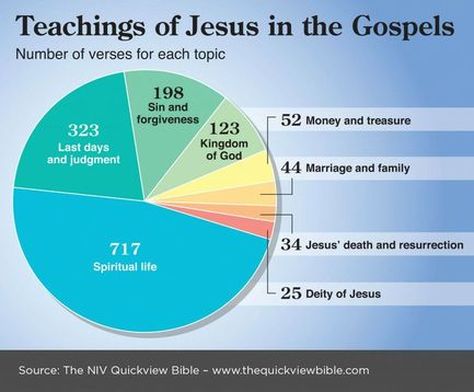
On the other hand, the graphic is successful in showing us several things. Even if we ignore possible or probable overlaps, we can still see the centrality of some of these great themes of Jesus’ teaching; and some – such as marriage and family – may come as a surprise.
As with any other infographic, we must always ask ourselves what other ways the pie could have been sliced. For example, if we made a category for “Prophetic statements,” it would have to include many of those in the “Kingdom of God” category, as well as all those from the “Jesus' death and resurrection” and “Last days and judgment” categories. As such, at as many as 480 verses, it would clearly become the second largest category. But we can do some of this re-cutting of the pie by simply adding relevant categories to form new ones. If we are willing to take the time to do that, graphs of this type become even more significant.
Most infographics are also limited in the ability they give us to distinguish between real and apparent significance. I would presume that the Parable of the Lost Coin is included in the section on “Money and Treasure,” but if we read that parable we find it is not about money as much as it uses money as a metaphor for something else. In cases like this we need to be careful that we do not think that Jesus put more stress on the importance of money than he really did – something an infographic can’t really show us.
Ultimately, then, by their very nature, infographics are always going to be limited in the degree that they can be specific about details, but the one we have chosen here represents particularly difficult data to present. The graph still shows us interesting and important things, however, and if we think about it, we can see just a little bit more clearly what Jesus talked about.

 RSS Feed
